Responsive curved line with gradient
Published on Aug 10, 2024

While working on a design, I encountered an interesting challenge: implementing a component that displays a curved line positioned between page sections, seemingly connecting them. Moreover, the horizontal coordinates of this line's connection points with the sections could vary. Here's how it looks in the design:
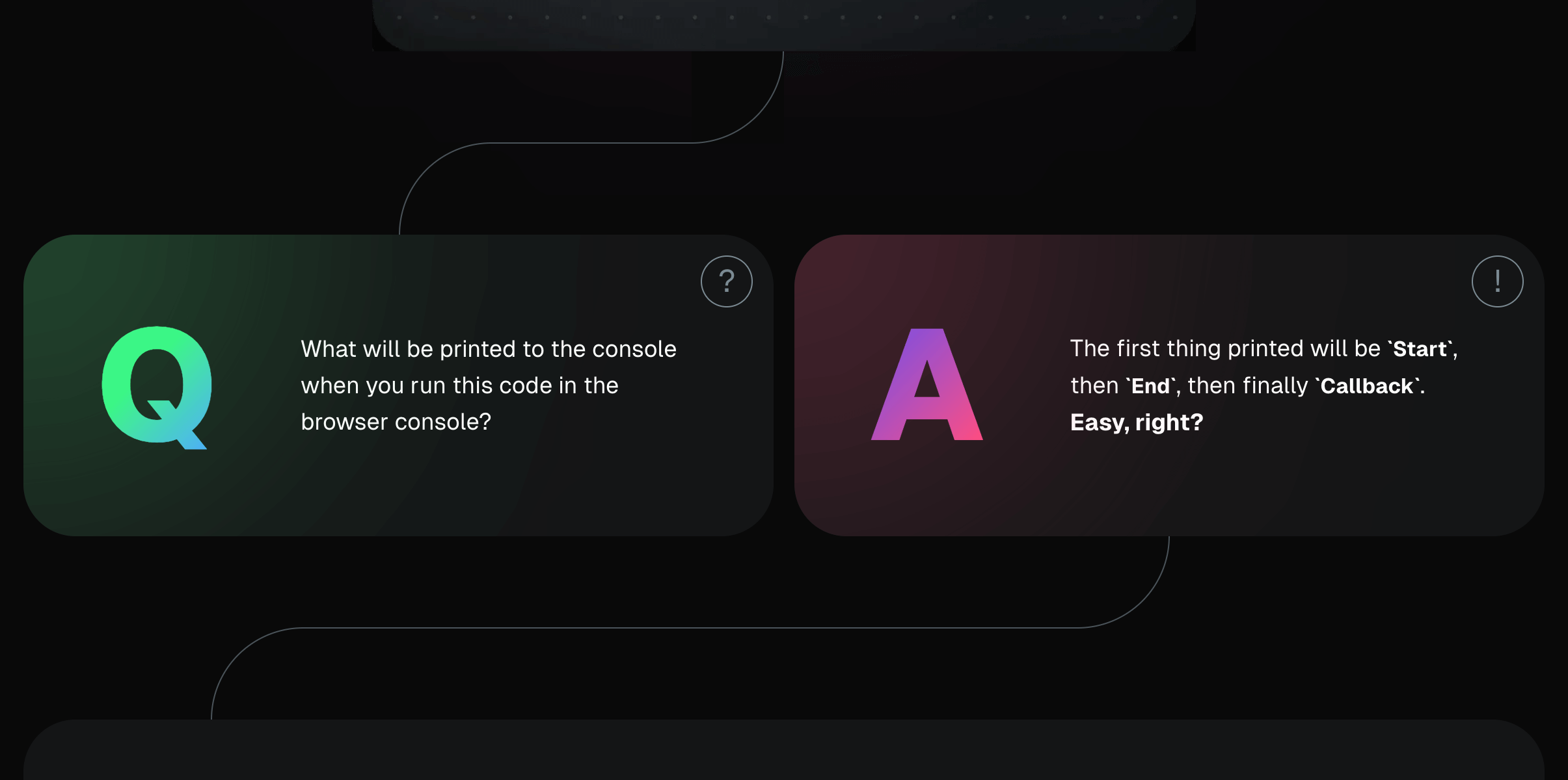
After scrolling through the entire design, I realized the task had become more complex - in some places, this line needed to have a gradient fill:

Thus, the task is as follows: implement a component that
- is responsive
- accepts the following parameters:
- component height
- coordinates of line offsets relative to the left and right edges of the content
- in case a gradient is needed - start and end colors
- uses minimal markup and is flexible in configuration
The project uses the following technologies:
- React
- TypeScript
- TailwindCSS
General Idea
The component structure consists of:
- An outer container
#wrapperwith relative positioning - An inner container
#inner-containerwith absolute positioning relative to its parent (since we're using absolute positioning, we can set left and right offsets by specifyingleft: Xandright: Xvalues). This container also contains the horizontal line centered vertically. - Two inner blocks (equilateral, meaning their width equals their height)
#overlay-leftand#overlay-right, which have the same background as the page and display the left and right roundings (I'll use a:beforepseudoelement to display the roundings). These two blocks are positioned at the bottom left and top right of the inner container#inner-containerand overlap the horizontal line due to their background. Schematically, it looks like this:
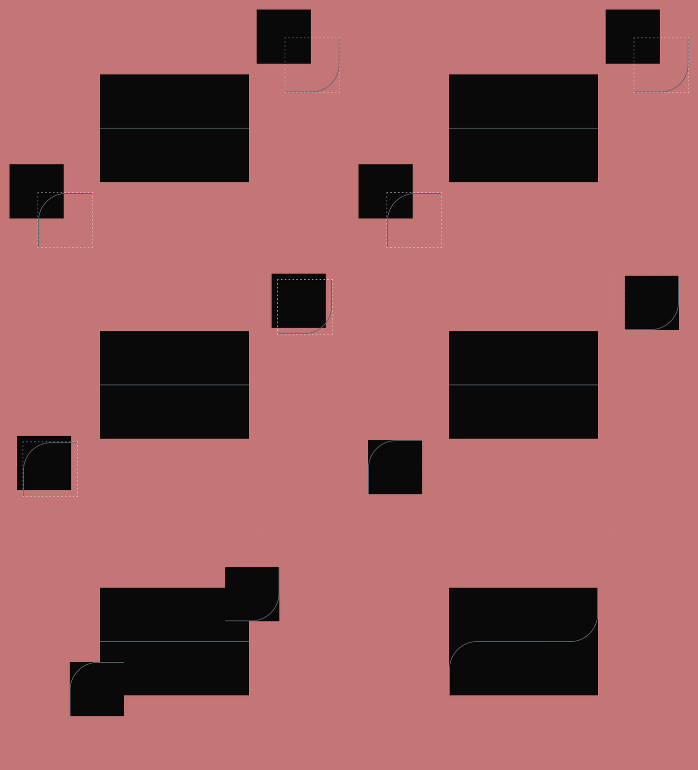
Let's take a closer look at what's shown in the slide above. For symmetry, the outer container should have a height equal to an even number (in px) + 1px (thickness of the horizontal line). So, for a hypothetical container height of 100px (which we'll base our calculations on), the actual height will be 101px. This way, the horizontal line, being vertically centered, will be vertically positioned at (100px / 2) + 1px from the top border. In other words, outer container's height consists of 50 + 1 + 50px (101px). Consequently, the two inner blocks positioned at the bottom left and top right, to overlap the horizontal line, should have a height of 50px + 1px.
For convenience in calculations within the component, I'll create local CSS variables. Let's finally get started:
Necessary styles and global variables:
@tailwind base;
@tailwind components;
@tailwind utilities;

:root {
  --foreground: #fff;
  --background: #000;
}

body {
  color: var(--foreground);
  background: var(--background);
}
Initial component markup:
import * as React from 'react'

const CurvedLineIntersection: React.FC = () => {
  return (
    <div
      id="wrapper"
      className="relative h-[calc(var(--height)+1px)] w-full"
      style={
        {
          '--height': '100px',
        } as React.CSSProperties
      }
    >
      <div
        id="inner-container"
        className="absolute inset-0 bg-gradient-to-r from-[var(--foreground)] to-[var(--foreground)] bg-[length:100%_1px] bg-center bg-no-repeat">
        <div
          id="overlay-left"
          className="bottom-0 left-0 before:rounded-tl-full before:border-l before:border-t before:border-[var(--foreground)] bg-[--background] absolute size-[calc(var(--height)/2+1px)] before:absolute before:inset-0" />
        <div
          id="overlay-right"
          className="right-0 top-0 before:rounded-br-full before:border-b before:border-r before:border-[var(--foreground)] bg-[--background] absolute size-[calc(var(--height)/2+1px)] before:absolute before:inset-0"/>
      </div>
    </div>
  )
}

export default CurvedLineIntersection
- The local CSS variable
-heightis defined with a value of100pxthrough thestyleattribute in the#wrapperblock - The horizontal line is implemented using a
linear-gradientbackground in the#inner-containerblock - The left and right roundings are implemented using
:beforepseudoelements for the#overlay-leftand#overlay-rightblocks
Now let's create several instances of the component on the page:
import CurvedLineIntersection from '@/components/curved-line-intersection'

export default function Home() {
  return (
    <main className="p-8">
      <section className="bg-stone-500 h-36"></section>
      <CurvedLineIntersection />
      <section className="bg-stone-500 h-36"></section>
      <CurvedLineIntersection />
      <section className="bg-stone-500 h-36"></section>
      <CurvedLineIntersection />
      <section className="bg-stone-500 h-36"></section>
    </main>
  )
}
Here's what we got:
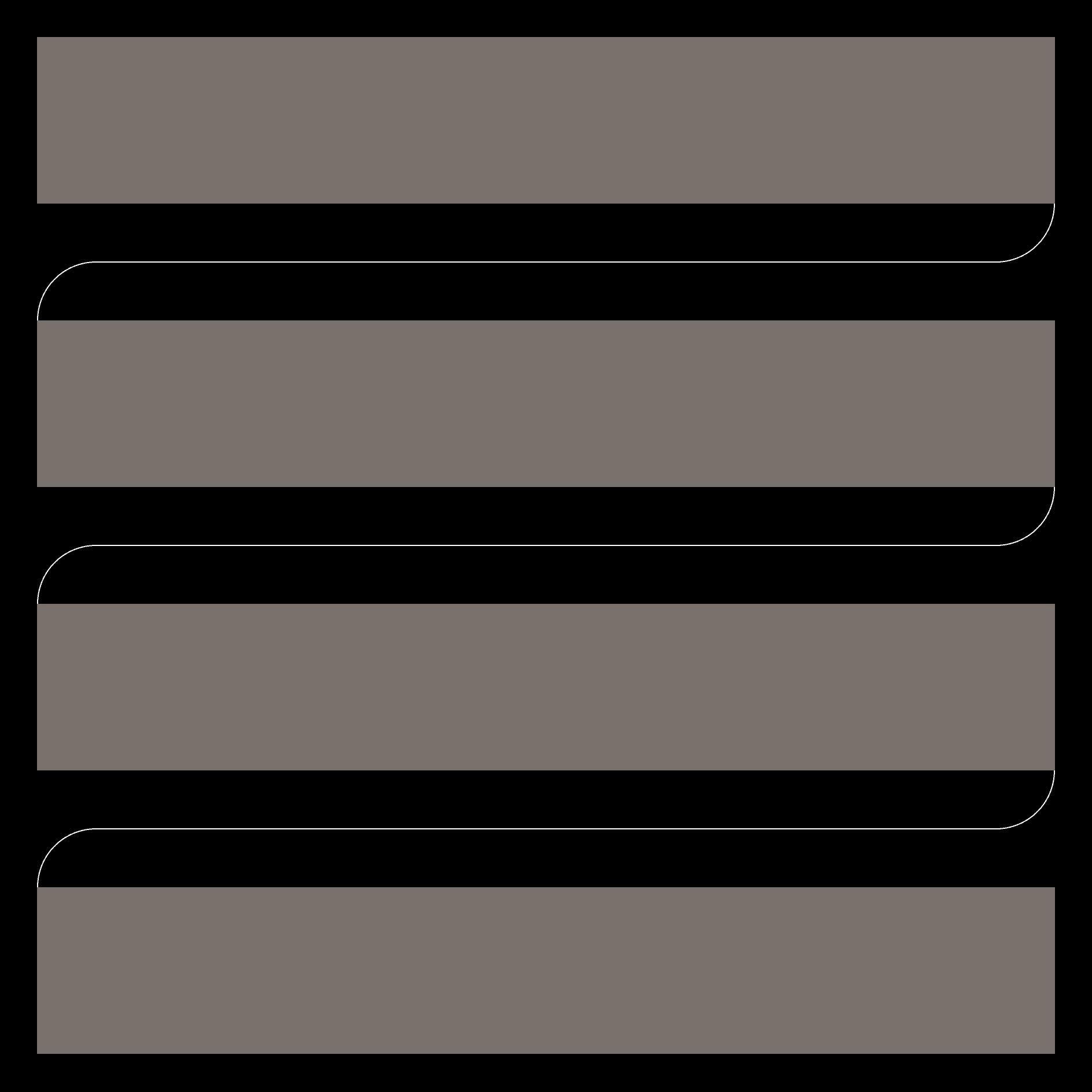
At this point, the component height, the color of the horizontal line and roundings are hardcoded. Let's implement the ability to pass height and colors through props and set some default values, as well as create corresponding local CSS variables. We'll also extract some common classes into a variable for cleaner code:
import * as React from 'react'
import { cn } from '@/utils/cn'

interface CurvedLineIntersectionProps {
  height?: string
  startColor?: string
  endColor?: string
}

const commonStyles =
  'bg-[--background] absolute size-[calc(var(--height)/2+1px)] before:absolute before:inset-0'

const CurvedLineIntersection: React.FC<CurvedLineIntersectionProps> = ({
  height = '100px',
  startColor = 'var(--foreground)',
  endColor = 'var(--foreground)',
}) => {
  return (
    <div
      id="wrapper"
      className="relative h-[calc(var(--height)+1px)] w-full"
      style={
        {
          '--height': height,
          '--start-color': startColor,
          '--end-color': endColor,
        } as React.CSSProperties
      }
    >
      <div
        id="inner-container"
        className="absolute inset-0 bg-gradient-to-r from-[var(--start-color)] to-[var(--end-color)] bg-[length:100%_1px] bg-center bg-no-repeat">
        <div
          id="overlay-left"
          className={cn(
            'bottom-0 left-0 before:rounded-tl-full before:border-l before:border-t before:border-[var(--start-color)]',
            commonStyles
          )}
        />
        <div
          id="overlay-right"
          className={cn(
            'right-0 top-0 before:rounded-br-full before:border-b before:border-r before:border-[var(--end-color)]',
            commonStyles
          )}
        />
      </div>
    </div>
  )
}

export default CurvedLineIntersection
And let's pass these parameters to components:
import CurvedLineIntersection from '@/components/curved-line-intersection'

export default function Home() {
  return (
    <main className="p-8">
      <section className="bg-stone-500 h-36"></section>
      <CurvedLineIntersection height="150px" />
      <section className="bg-stone-500 h-36"></section>
      <CurvedLineIntersection startColor="#d946ef" endColor="#22c55e" />
      <section className="bg-stone-500 h-36"></section>
      <CurvedLineIntersection
        height="50px"
        startColor="#ef4444"
        endColor="#0ea5e9"
      />
      <section className="bg-stone-500 h-36"></section>
    </main>
  )
}
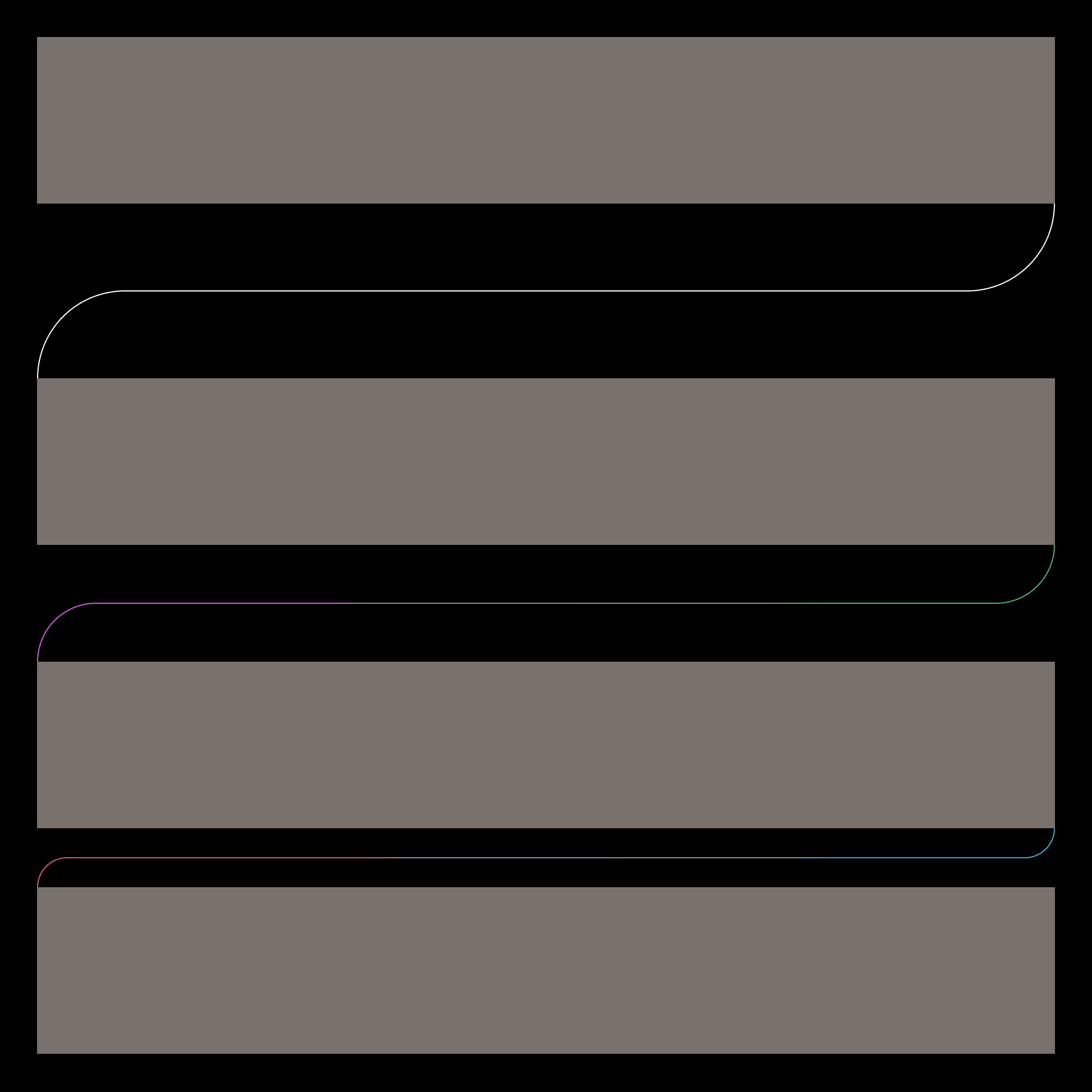
Result:
Now let's implement the ability to set left/right offsets from the content edges. For this, I'll pass TailwindCSS classes that will be applied to the #inner-container. At the same time, we'll add the ability to pass styles for the outer #wrapper container:
import * as React from 'react'
import { cn } from '@/utils/cn'

interface CurvedLineIntersectionProps {
  height?: string
  startColor?: string
  endColor?: string
  className?: string
  offsetClassName?: string
}

const commonStyles =
  'bg-[--background] absolute size-[calc(var(--height)/2+1px)] before:absolute before:inset-0'

const CurvedLineIntersection: React.FC<CurvedLineIntersectionProps> = ({
  height = '100px',
  startColor = 'var(--foreground)',
  endColor = 'var(--foreground)',
  className,
  offsetClassName,
}) => {
  return (
    <div
      id="wrapper"
      className={cn('relative h-[calc(var(--height)+1px)] w-full', className)}
      style={
        {
          '--height': height,
          '--start-color': startColor,
          '--end-color': endColor,
        } as React.CSSProperties
      }
    >
      <div
        id="inner-container"
        className={cn(
          'absolute inset-0 bg-gradient-to-r from-[var(--start-color)] to-[var(--end-color)] bg-[length:100%_1px] bg-center bg-no-repeat',
          offsetClassName
        )}
      >
        <div
          id="overlay-left"
          className={cn(
            'bottom-0 left-0 before:rounded-tl-full before:border-l before:border-t before:border-[var(--start-color)]',
            commonStyles
          )}
        />
        <div
          id="overlay-right"
          className={cn(
            'right-0 top-0 before:rounded-br-full before:border-b before:border-r before:border-[var(--end-color)]',
            commonStyles
          )}
        />
      </div>
    </div>
  )
}

export default CurvedLineIntersection
import CurvedLineIntersection from '@/components/curved-line-intersection'

export default function Home() {
  return (
    <main className="p-8">
      <section className="bg-stone-500 h-36"></section>
      <CurvedLineIntersection height="150px" offsetClassName="left-20" />
      <section className="bg-stone-500 h-36"></section>
      <CurvedLineIntersection
        startColor="#d946ef"
        endColor="#22c55e"
        offsetClassName="left-1/4 right-1/2"
      />
      <section className="bg-stone-500 h-36"></section>
      <CurvedLineIntersection
        height="50px"
        startColor="#ef4444"
        endColor="#0ea5e9"
        offsetClassName="left-[10%] right-[33%]"
      />
      <section className="bg-stone-500 h-36"></section>
    </main>
  )
}
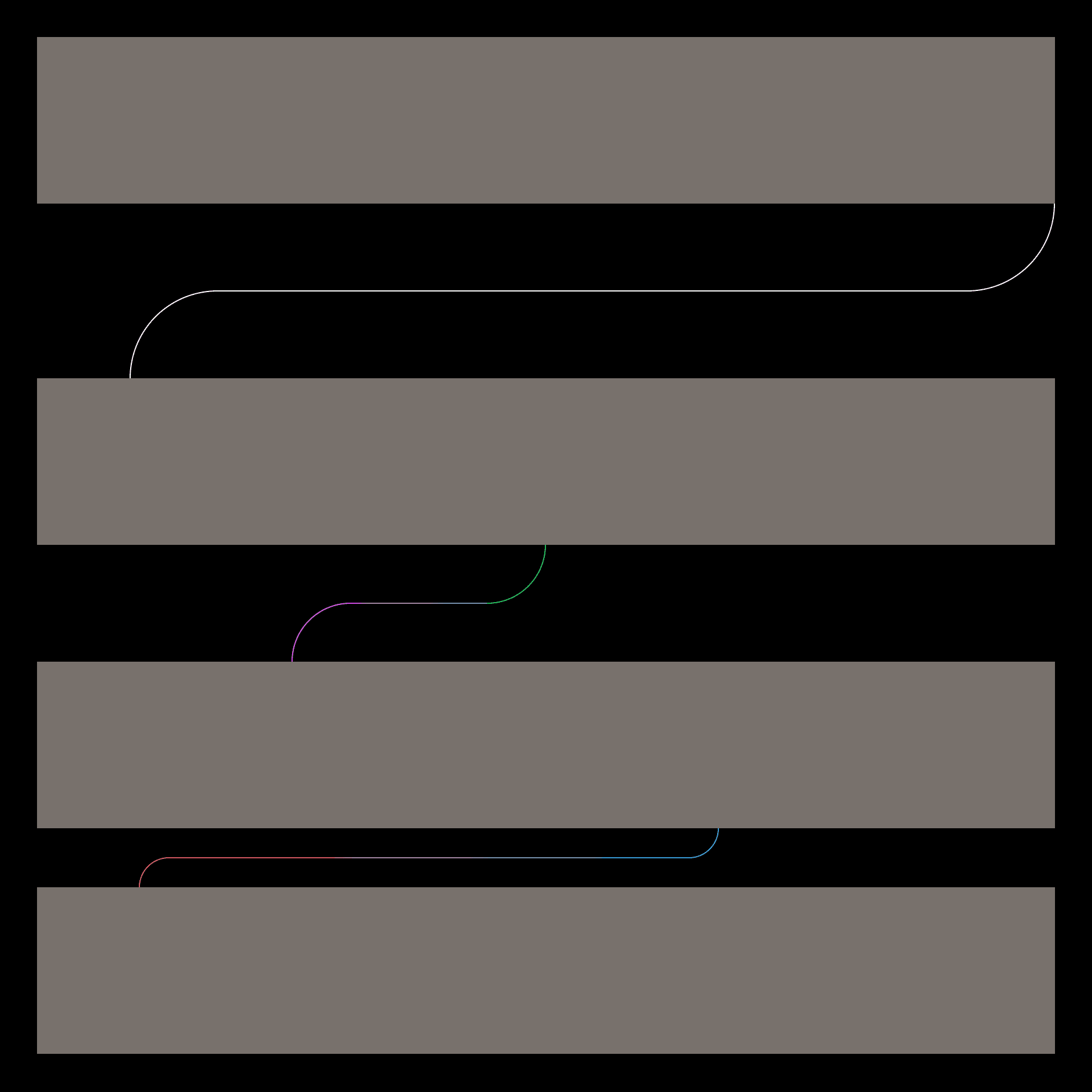
Here's how it looks:
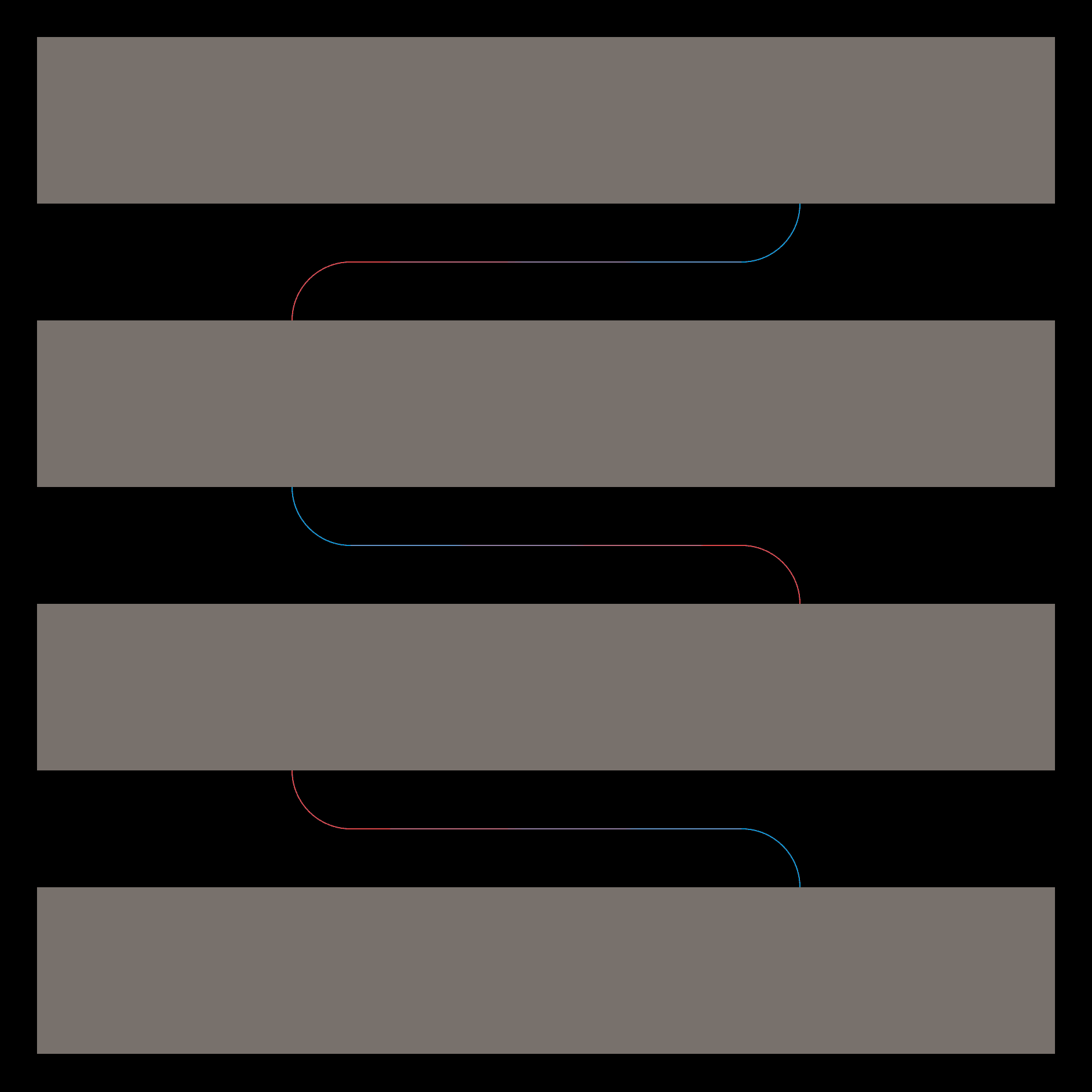
We can also flip the component vertically or horizontally using the -scale-x-100 or -scale-y-100 classes:
Thank you for reading to the end, and I hope someone finds this post useful.